
Hello Crafty Friends!
A few weeks ago an email landed in my inbox asking me, if I would like to review some Hunkydory products. I got to choose the products I wanted to work with and keep. In return I had to write an honest review and add the links to their products, both of which I will do.
I decided that I wanted to review their Prism Inks as I am always on the lookout for good stamping inks. To help me do this, I added a couple of stamp sets and a stencil ...

To go with the fruit and veg theme, I chose the following Prism inks:
Red Brick, Spring Meadow, Apple Green, Purple Velvet, Jersey Cream, Butterscotch and Slate Grey

Only light tapping was needed to ink up the stamps for good coverage and clear image stamping.
Here is one simply stamped creation using the Slate Grey Prism Ink which is fast becoming my favourite. It's a one-layer card to which I simply added a piece of coloured twine from my stash.

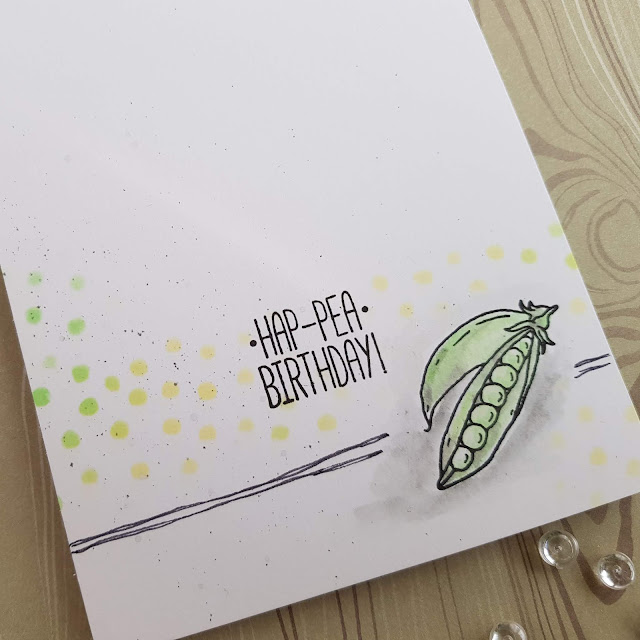
For my next two card, I did a bit of sponging and picked up some ink for watercolouring the peas ...

... both of which was easy to do. The ink colours layer well for watercolouring and adding shading.
The peas and sentiment were stamped with black Versafine ink from my stash. To finish, I simply added some doodles with a fineliner pen.
I am entering my card at Less Is More - one layer, spots
For my next card, I kept the same layout, added another border from the stencil and a bit more ink blending ...

The pale yellow of the Jersey Cream did blend with the Red Brick for a reddy orange.
For my next card, I did some more ink blending and then spritzed with water. The inks reacted really well.

Next I blended some Red Brick with Purple Velvet, a combination I really like ...

... I messed up the sponged dots (I didn't secure the stencil well enough) and had to bring in a stamp from my stash using Slate Grey to disguise my mistake.

I did sponge a die-cut I had in my stash and made this CAS card ...

I am entering my card at AAA Cards - one corner, optional twist flowers
Next I did some blending and watercolour scribbling on Mixed Media card ...

The pale Jersey Cream is a bit too pale for watercolouring larger areas which I a sort of expected given that using water with inks always dilutes the colours quite a bit hence it works better with strong and bold colours.
I used the stencil to doodle the triangles for my pineapple chunks on my sponged panel. The ink hadn't quite dried and I decided to sprinkle it with clear embossing powder and blend with a bit of Purple Velvet.

I stamped, watercoloured (Red Brick, Spring Meadow, Apple Green, Jersey Cream and Slate Grey) and fuzzy cut some pineapples to add to my card.
The great discovery was that the inks are slow-ish drying which means they can be used for heat embossing. (When using the Prism inks for stamping without wanting to heat emboss, simply allow for plenty of drying time. Alternatively heat set the stamped images to avoid accidental smudging) I tried the embossing on my watercoloured piece of card using the Jersey Cream with clear embossing powder for a subtle pattern ...

... which I turned into a not so subtle card adding more colour using some markers and a die-cut border from my stash. The sentiment is heat embossed using Spring Meadow and clear embossing powder.

My verdict:
I really like the Prism inks. They are very versatile and come in a good range of colours. It is definitely a product, I can recommend. The quality of the stamps and stencils is really good too.
Having never bought from Hunkydory before, I really surprised myself how much I liked their products. I will definitely get some more Prism inks and some other bits to try.
Here is one last look at my projects ...


That's it from me for today. Have a lovely week!
hugs
Monika xxx
Fruity Fun, Mixed Vegetables, Hip Hip Hooray!


And for the supporting role, I went with the following stencil and stamps:
For the Love of Masks - Hip Hip Hooray!, For the Love of Stamps - Fruity Fun and For the Love of Stamps - Mixed Vegetables. The mask is sturdy, has a good size and can be used for a variety of projects, mixed media or plain inky. The stamps are good clear polymer quality. I like the funny faces and punny sentiments.
For the Love of Masks - Hip Hip Hooray!, For the Love of Stamps - Fruity Fun and For the Love of Stamps - Mixed Vegetables. The mask is sturdy, has a good size and can be used for a variety of projects, mixed media or plain inky. The stamps are good clear polymer quality. I like the funny faces and punny sentiments.
The above names are all directly linked to the products in the Hunkydory Shop. I can honestly say, that before getting these products, I had never used Hunkydory stamps, stencils or inks.
My first impression of the ink pads ...
I like the curvy shape. The lid sits firmly on its base and won't fall off or break, if accidentally dropped. The lip on the lid makes it easy to open each ink. It also makes it easy to get hold of an ink pad when they are stored next to each other in a shallow draw or box which is good as they can't be stacked on top of each other.
The ink itself is contained in a sponge similar to the ones used for pigment inks. I much prefer this compared to the very smooth pads some other brands have on offer. I also like the sponges' curved edges. I can see the ink pads being used as stamps in their own right to stamp background accents.
The size of the ink pads will make it easy to ink up stamps without smudging the surrounding area when using a stamping platform.
Before doing anything else, I stamped the colours to see how well the ink matches the colour on the lid. They match pretty well.

Only light tapping was needed to ink up the stamps for good coverage and clear image stamping.
Here is one simply stamped creation using the Slate Grey Prism Ink which is fast becoming my favourite. It's a one-layer card to which I simply added a piece of coloured twine from my stash.

For my next two card, I did a bit of sponging and picked up some ink for watercolouring the peas ...

... both of which was easy to do. The ink colours layer well for watercolouring and adding shading.
The peas and sentiment were stamped with black Versafine ink from my stash. To finish, I simply added some doodles with a fineliner pen.
I am entering my card at Less Is More - one layer, spots
For my next card, I kept the same layout, added another border from the stencil and a bit more ink blending ...

The pale yellow of the Jersey Cream did blend with the Red Brick for a reddy orange.
For my next card, I did some more ink blending and then spritzed with water. The inks reacted really well.

Next I blended some Red Brick with Purple Velvet, a combination I really like ...

... I messed up the sponged dots (I didn't secure the stencil well enough) and had to bring in a stamp from my stash using Slate Grey to disguise my mistake.

I did sponge a die-cut I had in my stash and made this CAS card ...

I am entering my card at AAA Cards - one corner, optional twist flowers
Next I did some blending and watercolour scribbling on Mixed Media card ...

The pale Jersey Cream is a bit too pale for watercolouring larger areas which I a sort of expected given that using water with inks always dilutes the colours quite a bit hence it works better with strong and bold colours.
I used the stencil to doodle the triangles for my pineapple chunks on my sponged panel. The ink hadn't quite dried and I decided to sprinkle it with clear embossing powder and blend with a bit of Purple Velvet.

I stamped, watercoloured (Red Brick, Spring Meadow, Apple Green, Jersey Cream and Slate Grey) and fuzzy cut some pineapples to add to my card.
The great discovery was that the inks are slow-ish drying which means they can be used for heat embossing. (When using the Prism inks for stamping without wanting to heat emboss, simply allow for plenty of drying time. Alternatively heat set the stamped images to avoid accidental smudging) I tried the embossing on my watercoloured piece of card using the Jersey Cream with clear embossing powder for a subtle pattern ...

... which I turned into a not so subtle card adding more colour using some markers and a die-cut border from my stash. The sentiment is heat embossed using Spring Meadow and clear embossing powder.

My verdict:
I really like the Prism inks. They are very versatile and come in a good range of colours. It is definitely a product, I can recommend. The quality of the stamps and stencils is really good too.
Having never bought from Hunkydory before, I really surprised myself how much I liked their products. I will definitely get some more Prism inks and some other bits to try.
Here is one last look at my projects ...


That's it from me for today. Have a lovely week!
hugs
Monika xxx
Fruity Fun, Mixed Vegetables, Hip Hip Hooray!
Great set of cards, love the puns and they seem like fab inks. Thank you for playing at AAA Cards
ReplyDeleteAlways good to have an excuse to play and you got some freebies too!
ReplyDeleteThey look like versatile inks and the stamps look good quality too, a super set of cards Monika. :)
I so enjoyed reading your post and thank you for the honest opinion. What fabulous cards and such fun stamps x.
ReplyDeletePopped across from the LIM challenge, to admire your "spots" make, which is fab btw, gotta say - loving your punny (and funny) other makes too
ReplyDeleteKathyk
Great ink blending on that heart, love it! Super post about your thoughts on the inks, they certaainly look to be the ticket. Thanks for playing at AAA Cards, hope to see you join in with future challenges too.
ReplyDeleteLoving your CAS style, all great cards. Your peas with the spotty background is perfect for our challenge. All just works beautifully. Thanks so much for sharing with us at Less is More, Anita x
ReplyDeleteSuch a lovely CAS card! Love that bold heart! Thanks for joining AAA Cards! Hugs Åsa
ReplyDelete