Friday, 11 September 2026

Retro Gratitude 3

Hi Crafty Friends.

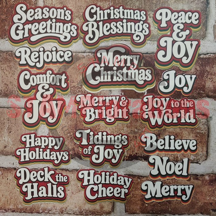
I'm back with the 3rd instalment of showcasing the Retro Gratitude STAMPcuts by STAMPlorations.

Today's cards are about creating striking cards with ease which led me to combining the Retro Gratitude sentiments with journaling cards and ready made card fronts.

Have a look at the two examples I made... 


My first card is all about colour for maximum impact. The dark chocolate colour of my base card and the pumpkin pie colour card used for matting beautifully complement and highlight both the colour of the journaling card used and the shadowing colours of the large sentiment. 

I simply added a small stamped sentiment and matching sequins to finish off.


My next card was even more quickly made. I framed my chosen card front with matching and contrasting card for my base card, added the sentiment and finished off with sequins.

The beautiful leaf pattern provides the perfect backdrop for my large sentiment.


Summing up today's cards:

Striking cards don't always have to involve lots of work, a few carefully chosen pieces and colours can really make a difference.

Simplicity can stand out.

That's it from me for today. Wishing you a lovely weekend.

Hugs
Monika 💕

Here is what I used:

Just a little reminder: I am on the STAMPlorations DT Team. Please be aware that the following links are affiliated links which means should you use them to make a purchase I will get a small commission at no extra cost to you.


Feel free to check out STAMPlorations Subscription offers for stencils, paper goods and stickers.

In addition please d check out STAMPlorations Freebie of the Month which will automatically be shipped with any order of $25 and over.


- from my stash
coloured card
Pumpkin Pie card by Stampin'UP!
Rich Cocoa Memento ink
sequins
glue
3D foam pads

Sunday, 6 September 2026

Retro Gratitude 2

Hi Crafty Friends!

I'm back with a second helping of cards using the Retro Gratitude STAMPcuts by STAMPlorations.

Have a look ...


For my first card combined them with some of the Autumn Cosy Ephemera Cuts popped up against my favourite stencilled retro background using the Tapestry stencil and Ovals Flexi-Template.


My second card uses a bit of background stamping, Art Marks 3, to add a bit of interest and bring my other elements together. My sentiment, ATC and Ephemera Cut were arranged to create one large focal point.


Rounding up today's post:

Try layering and moving elements about. It was this playfulness that led to today's card designs

I found that layered clusters of ATCs and/or Ephemera Cuts provide a perfect balance for the Retro Gratitude STAMPcuts sentiments.

Playfulness is key.

That's it from me for today. Wishing you a lovely week.

Hugs
Monika 💕

Here is what I used:

Just a little reminder: I am on the STAMPlorations DT Team. Please be aware that the following links are affiliated links which means should you use them to make a purchase I will get a small commission at no extra cost to you.


Feel free to check out STAMPlorations Subscription offers for stencils, paper goods and stickers.

In addition please d check out STAMPlorations Freebie of the Month which will automatically be shipped with any order of $25 and over.


- from my stash
cream card
Pumpkin Pie and Old Olive inks by Stampin'UP!
sequins
glue
3D foam pads

Saturday, 5 September 2026

Retro Gratitude 1

Hi Crafty Friends!

I have spotted some newbies over at the STAMPlorations Store ... the STAMPcuts Retro Gratitude, a set of 15 ready-to-use die-cut typographia pieces.

Well, I got some and had a little play. Have a look at my retro makes ...


My first card is designed to give a big, cheerful burst of thanks like rays of sunshine. The Radial Slimline Stencil fitted perfectly to provide me with the impactful background I was looking for to complement the sentiment. It was simply ink blended using Daffodil Delight and Miel inks.

The design focuses on showcasing the bold retro sentiment and my card was made to play along at the Word Power Blog Challenge - September 2026, Anything Goes as long as focus is on sentiment.
 

Now on to my next card ...


The star of my second card is ... the sentiment. This time I added a little interest and texture through the use of inlaid die-cutting. The Clustered Hearts provided the perfect link with the sentiment.

The sequins added a little playfulness to the design.


Rounding up today's post:

The large sentiments from the Retro Gratitude STAMPcuts set hold their place very well either against a bold background or on their own with minimal embellishments.

Inlaid die-cutting can be used to add interest and texture to these large sentiments.

Statement cards don't always need a lot of work. A few carefully chosen additions in combination with the Retro Gratitude sentiments and you're already there.

That's it from me for today. Wishing you a lovely weekend.

Hugs
Monika 💕

Here is what I used:

Just a little reminder: I am on the STAMPlorations DT Team. Please be aware that the following links are affiliated links which means should you use them to make a purchase I will get a small commission at no extra cost to you.


STAMPcuts Retro Gratitude
Feel free to check out STAMPlorations Subscription offers for stencils, paper goods and stickers.

In addition please d check out STAMPlorations Freebie of the Month which will automatically be shipped with any order of $25 and over.


- from my stash
cream card
Daffodil Delight ink by Stampin'UP!
Miel Izink ink
sequins
glue
make up brush for ink blending

Monday, 31 August 2026

Perfect Pairs - Serene Winter part 2

Hi Crafty Friends!

I'm really loving the Perfect Pairs products which STAMPlorations have recently released. Perfect Pairs are made up of stamps and coordinating Ephemera Cuts. They are perfect for beginners and experienced card makers/papercrafters alike.

Today I'm showcasing the Serene Winter set and how the Serene Winter elements can be combined with treasures from your STAMPstash.

Have a look ... 


Who doesn't love a good stew or hotpot? Well, it's the perfect ephemera for sending warm wishes during the colder time of year.
I went for a retro inspired stencilled background using colours mirroring the ones from the vegetables. The tapestry stencil is perfect for the retro wallpaper look set into the framed oval achieved by using the Ovals Flexi-Template as both mask and stencil by simply using one of the frames as mask and the neighbouring frames as stencil for the frame.
The sentiment is a shortened version of the Warm Winter Wishes die cut. I simply snipped it apart. The die-cut hearts are from the Clustered Hearts Die.


For my second card, I wanted to create a soft nostalgic feel without it being too vintage.

Well, I dug out an old favourite set of mine VIGNETTE Christmas Block to stamp the snowflakes. (A quick Heads Up, there are only 3 left in the shop. Get it before they sell out. It's worth it for the snowflakes alone. They are so useful.)

Winter Wishes need snow flakes especially when ice skating is involved. The background was stamped in old paper Distress Ink using the snowflakes and the 'Winter' stamp diagonally opposite each other.
This provided grounding for my focal point using three elements, the Felicity die-cut, the pine barrel and the ice skates which were popped up for dimension.

The embossed sentiment and red gems brought some warmth to the design and provided the perfect finishing touches.


Rounding up today's post:

Perfect Pairs, as shown with the Serene Winter collection, coordinate well with other STAMPlorations products.

Backgrounds don't always have to cover the whole of your card. The Ovals Flexi-Template in combination with the Tapestry stencil provides enough background to create the retro vibe complementing the pot of stew while two strategically stamped images on my second card provide enough background to help the focal elements to stand out.

Background colour doesn't always have to be contrasting. Picking out the two colours from the vegetables in the stew for the background stencilling helps draw the eyes to the warming stew one otherwise would have just glimpsed.

That's it from me for today. Wishing you a lovely week.

Hugs
Monika 💕

Here is what I used:

Just a little reminder: I am on the STAMPlorations DT Team. Please be aware that the following links are affiliated links which means should you use them to make a purchase I will get a small commission at no extra cost to you.


Perfect Pairs - Serene Winter, stamps and coordinating ephemers cuts
Feel free to check out STAMPlorations Subscription offers for stencils, paper goods and stickers.

In addition please d check out STAMPlorations Freebie of the Month which will automatically be shipped with any order of $25 and over.


- from my stash
cream card
Early Espresso, Cherry Cobbler and Crumb Cake card stock by Stampin'UP!
Pumpkin Pie and Old Olive inks by Stampin'UP!
old paper Distress Ink
Clear Versamark ink
white embossing powder
red gems
sequins
glue
3D foam pads

Friday, 28 August 2026

Perfect Pairs - Serene Winter part 1

Hi Crafty Friends!

I'm really loving the Perfect Pairs products which STAMPlorations have recently released. Perfect Pairs are made up of stamps and coordinating Ephemera Cuts. They are perfect for beginners and experienced card makers/papercrafters alike.

Today I'm showcasing the Serene Winter set on a couple of cards you can easily make yourself, just a little bit of masking and ink blending skills are needed.

Have a look ... 


I wanted to enhance the natural vintage-y look the Serene Winter Ephemera made me think of. A cream base card lightly blended with old paper Distress ink was a good start.
I then masked a narrow strip at the bottom of my card and repeat stamped the 'Winter' stamp from the set in Glamour Versafine Clair ink down the left hand side of my card.
Two of the ephemera cuts were layered and the 'Winter Wishes' sentiment stamped in Roasted Coffee Prism ink.
Card Candi dots, something I haven't used in ages, highlight the natural look and a sprinkle of glitter on the roof and twig of the ephemera cuts finishes the card off.


The background in my next card uses simple repeat stamping of the 'Winter' stamp rotating the stamp as you go along. Added interest and variation comes from the unevenly masked off border with sloping lines rather than ones in parallel with the card edges.
Coordinating ephemera pieces were clustered to highlight the social aspect of the sentiment. A solitray cup would have looked a little forlorn.
I picked on the red beads to bring warmth into my design by using red card for the embossed sentiment and red card candi as a finishing touch.


Rounding up today's post:

Old paper Distress ink softens the cream of my base card while at the same time enhancing the green found in the pine needles of the bird house and the twig thus creating balance with the red background stamping.

A pop of colour can really add warmth to an otherwise tone-on-tone card.

Last, but not least, picking out some older treasures as embellishments, which I did with the Card Candi, can add a cold finishing statement to your card.

That's it from me for today. I shall soon be back with part 2 of the Perfect Pairs - Serene Winter showcase.

Wishing you a lovely weekend.
Hugs
Monika 💕

Here is what I used:

Just a little reminder: I am on the STAMPlorations DT Team. Please be aware that the following links are affiliated links which means should you use them to make a purchase I will get a small commission at no extra cost to you.


Perfect Pairs - Serene Winter, stamps and coordinating ephemers cuts


Feel free to check out STAMPlorations Subscription offers for stencils, paper goods and stickers.

In addition please d check out STAMPlorations Freebie of the Month which will automatically be shipped with any order of $25 and over.


- from my stash
cream card
Cherry Cobbler card stock by Stampin'UP!
old paper Distress Ink
Glamour Versafine Clair ink
Roasted Coffee and Butterscotch Prism inks by Hunkydory
Clear Versamark ink
white embossing powder
Card Candi by Craftwork Cards
glue
glitter
3D foam pads